2016 MIAD Pre-collage.
Advanced Graphic Design.
|
During the summer of 2016, I took the advance pre-collage graphic design course at MIAD. It was a three week course, that took place Monday - Friday, 9:00am - 4:00 pm. I earned three collage credits for participating in this course. In the duration of the course, I learned multiple graphic design skills and also it enticed me into getting my BFA in communication design at MIAD.
|

|
|
|
|
I learned the essentials of Adobe Illustrator, In Design, and Photoshop. I learned the basics and also learned some more complex things about all of these programs. I learned about hierarchy and harmony in design. I also simply grasped the concept of what makes design good and what makes design bad. Learning about typography, image, and placement has made me realize that this is a type of creative work that I am interested in going to college for.
|
We started this class with learning about hierarchy. For hierarchy, you want to draw the viewer to the most important information first then draw the viewer around the page to the rest of the information. We did this by using only black squares. We made harmony and hierarchy with black squares.
|
|
Then to look at the world in a design perspective, we went out to find the alphabet. We look at everything as just objects but, we needed to look at objects in a different light.
|
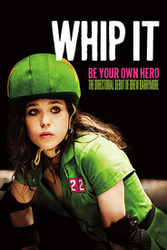
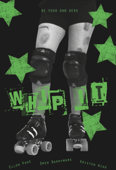
We all have a favorite movie that we like to cherish. People do that through movie posters but, not all movie posters are good design. Majority are either the classic blue and orange combo, or encased by the main actors face like my favorite movie Whip It. (Which isn't horrible because Ellen Page is awesome.) So my problem to solve was making a movie poster for someone who loves the movie and wants a poster to hang at home. I feel like this project was successful for me and the most fun to make. It is a little rough around the edges but, this was my first time using Illustrator. It was fun to make multiple drafts and trying new things.
Our last project was interesting. It was also a more realistic representation of real world graphic design in the fact that you don't really choice what design you want to do. We went to RandomWiki page and got our subject. Whatever subject we got we had to make a 4 spread of that topic. One of my classmates got wilderness diarrhea so, I am pretty happy that I got the 1933 24 Hour Le Mans Race. I turned my spreads into a comparison of the 1933 race, 1970 race and the 2016 race. One spread had to be text only, one have to be image only, one had to be image and type, and the the last one was our choice.
|
This was my third summer doing the MIAD summer pre-college program but, my first year doing the advanced course. I went into this years summer program not knowing what I wanted to do for college, not really knowing where I wanted to go, not really knowing anything. I went into this graphic design course thinking, "eh maybe." I wasn't sure what graphic design entailed and what the day to day job of a graphic designer was. Adam Setala was an awesome teacher. He knew what he was talking about. He gave be amazing and informative feedback. He answered all of my questions that I had. He made my class a great experience. Rebecca Mader is a graphic designer who graduated from MIAD and now works at CK in downtown MIlwaukee. She came and talked to our class and answered all of our questioned about the day to day of her job. They helped me decide that I want to go to MIAD to get a BFA in communication design.
Connecting to the ACT:
The inspiration put into this work was simple to make good design and present good communication to the audience viewing it. It helped me determine what needs to be put into the piece and what form of hierarchy it should have. For movie posters, creators of major movie posters objective is to show off the main actor as much as they can. I wanted to make my poster move pointed towards the topic of the movie. Some conclusions I have drawn from looking at design in our world is that the priorities of them is to show off famous people and other things to buy peoples attention. That is bad design. Design should be based around good communication through indirect visuals and good art skill.
The inspiration put into this work was simple to make good design and present good communication to the audience viewing it. It helped me determine what needs to be put into the piece and what form of hierarchy it should have. For movie posters, creators of major movie posters objective is to show off the main actor as much as they can. I wanted to make my poster move pointed towards the topic of the movie. Some conclusions I have drawn from looking at design in our world is that the priorities of them is to show off famous people and other things to buy peoples attention. That is bad design. Design should be based around good communication through indirect visuals and good art skill.
