Empty Space.
Package design / Communication design.
October, 2016.
Exhibition:
This packaging design was inspired by growing up in a single parent household. This represents my feeling of never having a father figure in my life. I considered all aspects of traditional packaging design of beer. I was inspired my Rebecca Mader. I used Adobe Illustrator to create this design.
This packaging design was inspired by growing up in a single parent household. This represents my feeling of never having a father figure in my life. I considered all aspects of traditional packaging design of beer. I was inspired my Rebecca Mader. I used Adobe Illustrator to create this design.
Artist Inspiration:
Over the summer, I met graphic designer and graduate of MIAD Rebecca Mader. She came into my pre-college class and talked about her experience at MIAD and her life as a graphic designer at CK. I loved how much she loved her job and she was an amazing person. I liked all of her work done in her college career at MIAD. I want to do work that can get me ready for MIAD and give me experience.
Process:
I started by making sketches. I had an idea in my head of a modern day bottle design. I googled beer packaging designs to get an idea of the placement of things. 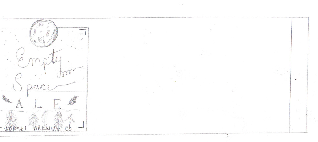
This sketch was to get an idea of how to make the design when I print it.

|
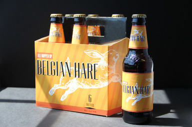
I love this deign by Rebecca called Belgian Hare. It was created in May, 2013 at MIAD for branding and packaging. The form of hierarchy seems to be perfect. I also love her use of white with the hare in the background. She then makes the title pop by using black on the bright orange.
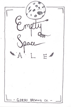
I liked the title I created on this sketch above. I think it has a lot of character. The form of hierachy the title creates is ideal. You want to viewer to look at the most important thing first and the title draws my eye first.
Blue is my favorite color and blue is obviously a symbol of sadness. I found this blue black gradient online. I think this background will add onto the forms of hierachy. It will helps bring the viewers attention through the piece.
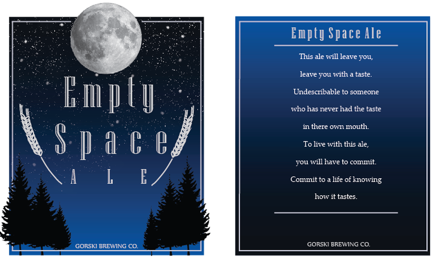
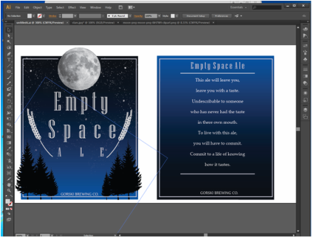
I then began to create my landscape. I bordered off the outline and left a space for the moon. I notice this technique to be a very modern day use to draw people in. I gives the moon some demension. |
|
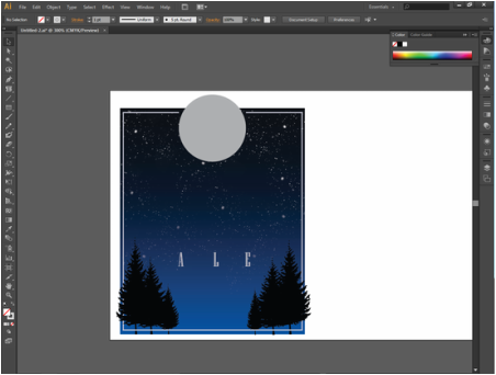
I got an image of stars and spread them out throughout the background. The lower the stars got the more I lowered the opacity to create the sense of space. I also added tree silhouettes and changed the sizes to create depth. The bottom of the border I put the trees behind the line. Then on the sides I put the trees infront to create a 3d effect.
At this point, I began to decide a typeface to use. I wanted to pick a face that connects to typical modern day types on beer and ale. I wanted this piece to obviously be appeling to the audience it is meant for. |
|
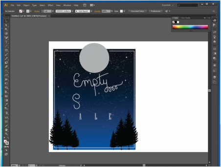
In my planning sketches, I created a kind of playful font. That was very very hard to recreate onto the computer. The characteristics of my sketch did not transfer to illustrator.
I tried for a long time to try to create the font because I really liked it. I think it gave an urban vibe. But it was not coming out the way I wanted it too. I looked juvenile on illustrator. |
|
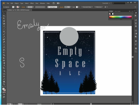
I decided to go with the same font as the word ALE. I looks appealing and fits in. I wish I was able to create the font I wanted but, This looks way more clean and professional. I like how the design looks this far. It isn't a very typical beer design. I does kind of look like an art project and not an actual design but, it does have space and depth within it. I then created wheat strands using the paintbrush feature of illustrator. This is a very typical detail added onto to beer labels. Since my design was becoming not so typical for beer labels, I wanted to bring it back to the typical design of beer.
Between the trees, I added GORSKI BREWING CO. To connect it back to the reason I am creating this piece. 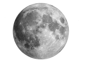
|
|
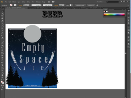
I added a realistic image of the moon in the space for it.
Normally, there is a nutrient facts and a barcode and what not. I decided to add a poem. "This ale will leave you, leave you with a taste. Undeescribable to someone who has never had the taste in there own mouth. To live with this ale, you will have to commit. Commit to a life of knowing how it taste." - T.G. |
Reflection:
In the end, I made this piece for a specific reason. Yes, it was to help my graphic design skills, yes, it was for school. But, it really demonstrates my content feelings towards not having a father in my life. As I was younger it was difficult and confusing. But, I am a young adult now. I know things happen for a reason. He had a choice to life his life how he wanted too. I am a choice to not let someone who is nt in my life slow me down.
At the beginning of this piece, I was worried how it would turn out because the font wasn't working out and it wasn't really looking like a beer design. After it all came together though, it may not look like a beer label but, I think it serves it's purpose.
At the beginning of this piece, I was worried how it would turn out because the font wasn't working out and it wasn't really looking like a beer design. After it all came together though, it may not look like a beer label but, I think it serves it's purpose.
ACT Questions:
- Clearly explain how you are able to identify the cause-effect relationships between your inspiration and its effect on your art work.
Rebecca Mader's work influenced me to create a modern day beer label design. The design she create was create at MIAD and I thought if I could start thinking of projects I could be doing in a couple of years there.
- What is the overall approach the author has reguarding the topic of your research?
- What kind of generalizations and conclusions have you discovered about people, ideas, cultures, while you research your inspiration?
Creating designs is difficult but, very fun. You have to think of your audience and viewers always. Being in Milwaukee, I see a lot of local beer designs and that helps me get an idea of modern and appealing designs.
- What was the centeral idea or theme around your inspirational work?
The idea for this piece was my life growing up with out a father. It's not meant to be depressive. It is meant to show that it was difficult for me but, I am old enough to understand and cope with my life.
